Monday, 12 December 2011

Main Task: Unmanipulated Photos

These particular picture was the picture that I wanted to use for my front cover. Reasons as to why I dint use it was because the picture looked armature, even though it was portraying the main story, it wasn't eye catching .


Because I wasn't planning on using two pictures for my contents page, my original plan was to use this picture of Jessica to portray empowerment, however it didn't have no relation to the main story. It portrayed too much strength and not enough sadness and that was what the main story depicted.


In addition to this I decided to use the picture as my contents page because there was space on the left were different contents of the magazine could be laid out. However my teacher recommended that I should use a second picture on my contents page so I had to take more pictures of another person.


The reason why I didn't chose this particular picture for my contents page is that the subject looked to childish and it didn't relate back to my target audience and my aim was to portray strength, whereas this picture was too sweet and wouldn't appeal to my target audience.


In regards to my double spread page, now that I had figured out my story, the picture had to relate to it and the emotions in the subjects face had to also relate to the main story. My first choice was to choose this picture but it would have been better to use this particular pose for my front cover.


I came up with the idea of the subject laying down. I took many picture of the subject in the same position but at times I wouldn't hold the camera properly so the pictures would come out wrong, or the camera would be too far from the subject or too high. While doing this I was also trying to visualise where my text would go and my title.

Monday, 5 December 2011

Main Task: FC,CP,DPS Mock Ups


Main Task: Case Study Of A Publishing House

The company that I have researched is Conde Nast. It has produced up to eighteen consuming magazines including Vogue and The New Yorker. As a company they have been able to invest in things such as developing a particular application on their reader’s devices such as phones and websites. The company was found in 1909 by Conde Montrose Nase and has been owned by the Newhouse family since 1959.


Conde Nast publishes different types of magazines such as Vogue, The New Yorkers, Vanity Fair and Bon Appétit. Magazine such as Vogue became a weekly publication in the United State in 1892. Arthur Tumure became to establish the magazine and started to send it over seas. Vogue was first published in Britain in 1916 and Italy and France by 1920 where it then had a huge success. As for the magazine, The New Yorker, this also started as an American magazine and included fiction, essays, cartoons and poetry. It started as a weekly magazine in 1925 and was published 47 times on an annually basis. Although the magazine had current event on what was going on in New York at the time, it had a wide audience outside of New York and was well known for it topical covers and its illustration.


Conde Nast includes different celebrities into their magazine and they also cover different aspect of the society. For example their House and Garden magazine contrast between homecare and gardening and the target audience for that particular magazine is families, for wives and husbands who work on the expressive and instrumental role in the households. They cover bridal event, holidays and general gossip about celebrities which could indicate on how wide spread their company has become. In addition to this they also have website links for each magazine so that their audience have closer contact with them because the society is now developing and people now carry their devices with them where ever they go so they are able to read the latest article for that particular week on their phones or laptops. From the way the conduct and portray their magazine, this shows that their audience could be for higher class but s they cover nearly every aspect of society this could also be used for working class also. However because their magazine such as Vogue is a high fashioned magazine ad is well respected in the fashion industry, clothing lines that they will be promoting will be far to expensive for someone of a working class. In addition to this their interior magazine covers a vast majority of different decorations for someone’s house and with this magazine it is more conducted to an audience that is more of a higher class.


However, with my magazine, Misstress, in contrast with magazines such as Vogue there is some sort of similarities mainly because Vogue includes gossip and fashion and so will my magazine but with in the fashion aspect of things my magazine will only cover fashion from the “RnB” aspects of thing, and the gossip will be generally based on familiar RnB artist such as Rihanna and Chris Brown.

Monday, 21 November 2011

Main Task: Audience Research

While profiling my audience I thought about what type of people I would ask and where I would ask them the questions. I thought of common social media applications that I had. Applications such as Facebook and Blackberry messenger. I chose Blackberry messenger because I knew I would get answers quickly, whereas Facebook would take some time.


I picked three random contacts with different insights on music and how it made them feel. My aim was to have some understanding of what my target audience would be for my magazine and which one I could relate to the most.


1. Are you interested in music magazines and why?


This answer given gave me some underlining factors about magazine and what my target audience would be looking for and what attracts them and in the case one of them was fashion.


How does RnB inspire you?


I purposely said RnB as my music genre because that was the only genre in music that I was truly aware of. Similar to this i was unaware as to what gender I was focused on, hence the reason why I chose to talk to a male in this particular research.


With the response that I got from him I knew that my male audience will not be as engaged because music didn't inspire them to do anything, whereas for females it was the opposite. In addition to this if I chose female as my target audience I would have more to relate to and addition things to write about. This would make things easier for me.


3.What inspires you to listen to music?

Similar to my previous question that was asked to the male, I thought it would be better if I changed the concept of the question to see if I would get a different answer. In addition to this focusing on a female audience was beginning to be my favourable choice because I was able to relate more to them.


when I had asked the question the response gave me an idea of how I wanted my magazine to influence my target audience. I wanted them to be motivated, so they didn't feel as if they needed to relay on anyone but then still had fun and made themselves feel good by knowing the new fashion trends and feel good about themselves. With this information I had the foundation of what I wanted to base my magazine on.


Saturday, 19 November 2011

Main Task: Profiling Your Audience


Misstress: Yinka is 19, she is very passionate and loves her rnb. Inspired by the 80's rnb which has now influenced music of today. Yinka not only loves the style of the music but the versatility and the music video which gives the music a story. Yinka is in full time education and in her free time she goes out with her friends to urban clubs and she is a really stylish hairdresser. With a bubbly attitude and a swagger you could kill for, her image is inspired by the music she listens to, artist like Beyonce and Rihanna. This doesn't only inspire her clothing but also inspires the way she postures herself and her hairstyles.

Friday, 4 November 2011

Main Task: Post Production Feedback

I used Blackberry messenger to find peoples opinion and their thoughts about my front cover, contents page and double spread page of my music magazine.


Front cover feedback:


My audience thought that my choice of colour was very consistent throughout the magazine and they all contrast with the main image. The fact that I spelt ‘MISSTRESS’, my audience thought that it was creative and it supported the reasons as to why I chose my target audience, it also made it unique and very creative. My use of font brings excitement to the magazine and it engages my audience to read the article. Another comment was that it looked similar to a professional magazine.


However my audience stated some facts about my magazine and what needs to be changed. They thought that the promotion in the 'Top 10 classic Rnb' doesn't make the magazine look as if it is in unison with the rest of the magazine, it doesn't stand out but blends in with the background. Another comment was that there was too much going on, such as names and event, and brighter lines so that it can become more noticeable. It would have looked better if I added pictures of artists that I named on the cover line. Some of my audience thought that I should have done the masthead and the cover line in different colours so it can stand out.


Content page feedback:


The people that I asked all thought my contents page was good and my pictures were of good quality and were unique, on the other hand some comments were addressed and some individuals thought that the white outlines were too much and the pictures used in the contents page should be spread out. The colour scheme is not attractive, however the pictures used brings the message that I'm trying to portray which could empower women which will make them engaged.

Double spread page:


In relation to the contents page, my audience like the double spread page and the way that it is laid out, however some individual said that the way in which the picture is taken it doesn't look professional and the colour of the font makes it hard to read. In addition to this, they thought that I should have used a different colour for my font because I used the same colour for the front page so it would have been best if I changed it.

Main Task: Double Page Spread Conventions Diagram


Main Task: Content Page Conventions Diagram


Monday, 31 October 2011

Preliminary Task: Front Cover Convention Diagram


Main Task: Double Page Spread Texual Analysis


Denotation: what you can see is that t on the right hand side there is a close up image of the celebrity that the article is about. She is dressed formally with a leather it on. Her facial expression is not formal rather than very flirtatious. On the other side of the page there are two other pictures and not as much text and from what we can srethetre is three questions being asked and then later on continues in the other page. The subject is very eye catching and it rhymes in with her name; the font is also very big and could engage the audience, the font contrast with what the article might mean or what it is probably about. There are different sizes of fonts so the readers have some knowledge of what the article is about, the bigger fonts the more knowledge the reader will have on the article. On the other side of the double page, where the main image is being portrayed, there is a quote from the article that is on top of the main picture so readers can have some knowledge on what the article and what questions they might be asking Eva Mendes.


Connotation: the main image on the right hand side of the page could indicate the meaning of the article, this could suggest that the article may be about a male, this is probably because she has a tie and her hair is back, this could also symbolise being a hard working person. On the other side of the double page spread there is two other small images. One of them include Eva Mendes is holding a perfume that is red and noticeable, on the other picture she is wearing red lipstick which contrast with the other picture on the same page. This now make a colour scheme which is black and white and a little hint of red and this continues throughout the double page. The font used could symbolise femininity and probably her explaining her secrets that her fans don’t know about their which could be naughty, which the reader can depict from her pictures and how her facial expressions is.


Mise-en-scene: She is dressed very formally, with her tie and white shirt. A ring is also shown, which could give the reader some understanding of what the article might be about, she probably has jewellery and a perfume line. However, her makeup is very natural but her eyes are very fierce. this could be because she has two other pictures on the other side of the double page and it wouldn’t balance out if there was too much going on, hence the reason why there isn’t that much text being used.


Lighting: There are three pictures on the double page. The main picture s a reader’s high-key light, making it look natural and not to dramatic because it is zoomed in, so the readers will be aware of who the article is about. On the bottom right hand side there is another picture when she has a piece of jewellery in her mouth with very distinctive red lipstick. The lighting of this picture is low-key lighting so her lips and the jewellery is being advertised and is the most noticeable thing in the picture. The last picture that is on the right hand top corner is shot in black and with however the perfume that is being advertised is also noticeable. This is also shot as high-key lighting.


Main Task: Front Cover Textual Analysis


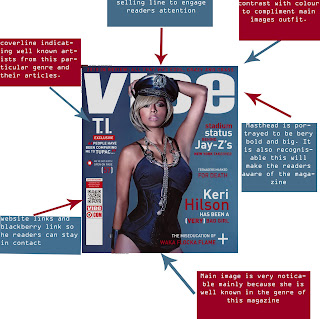
Denotation: In this magazine we can see a well known RnB artist know as Keri Hilson posing in a very sophisticating way. The background is plain and has a shade of black. The fonts used contrast the background colour. In the front cover you are able to notice that the artist mentioned are written in big and bold font to engage the reader and to inform them of articles that this magazine will include. This indicates that the reader already has some sort of knowledge as to what the magazine is about with seeing the front cover. There is little text used on the front cover, this could be because of the main image and this already catches the reader’s attention and with the artists name s that they have already used, because they are well known in the music industry and in RnB and hip hop, the small information used will connect the reader’s attention. Te colour red and white is used as the fonts which contrast well together and also with the background, even with the bar code indicating the blackberry messenger add, the three coloured used are also included. The colour scheme is continuous and no other colour is used to make a colour clash.


Connotation: The main image symbolises what the article written about the artist Keri Hilson and how she has been a '(VERY) Bad Girl'. The main image shows control as she has a police hat on which could be shown that her behaviour as being someone who doesn't care about the law and s on, and this is the main representation of 'bad' people in general. In addition to this she is half naked which also refers back to the cover line article that has been written about her. Her facial expression symbolises an emotion of not caring and very relaxed but still very sexy. Her makeup contrasts with the back ground, all the way to her nail vanish. The background colour contrast with the main images makeup and the black used in the background also contrasts with the main images outfit, which make the outfit noticeable.


Mise-en-scene: On the main image there are not as much cloths and she is wearing a police hat which indicates that she is in charge. The readers can also interpreted this as becoming independent and representing women which her album is all about (No Boy Allowed). The outfit that she is wearing shows her figure which could portray the target audience for this particular magazine. The lighting is focused on her face to show her facial expressions which conveys power and control which is also symbolised in her outfit that she is wearing, this is also called high-key lighting which is usually bright and natural. The lower part of her body, the light isn't as much as is darker compared to her upper body. Her facial expressions are demanding and she is in control but rather than being forceful with her expressions she is being sexy. Her body language is exposing her curve and she has her left hand placed on her head which could symbolise the un-expediency of her now being in control. She uses silver accessories which once again contrast with the background, and her hat has also got traces of silver.


Target Audience: the target audience could be both sexes. This is mainly because the main image portrays what Keri Hilson’s album is about, which is about women becoming independent and not having to depend on men, however this could attract men as well. Well known male hip hop and rnb artist are shown on the front page which could engage male to read their particular article and also Keri Hilson is looked to be a sex symbol and because her pose is very sophisticating and sexy this could also engage men. Because the main picture is so engaging there is not that much text used because the target audience that the magazine is aiming at should be aware of the artist Keri Hilson so they would already have some understanding about her album, or they would want to know if there was any new information with her. It’s as if the company uses specific artist that are well know to employ their target audience.


Masthead: The masthead is very distinctive and is one of the colours being used that gives the front cover some sort of harmony and contrast. It very bold and is spread out evenly so even when covered by the main image it can still be recognised. The font is big but soft, it is not written in capitals which gives it more of a soft edge rather than a fierce edge which is the opposite of what the main image is portraying, which is being fierce. This could be because if the masthead is too fierce or distinctive because it will probably clash with the main image. This could probably take the impact on the emotion and the message that the main image is trying to portray, and it will probably take the message away if the masthead was sharp.

Main Task: Project Introduction

My name is Itunu Makanjuola and I am learning AS Media at Christ The King Sixth Form College. I am creating a music magazine which will include a front cover, content page and a double spread page. The genre that I have chosen is RnB and soul. The reason why I chose this particularly genre is because this is the genre of music that I am comfortable with and listen to the most.

Monday, 3 October 2011

Preliminary Task: College Magazine textual analysis


Check Spelling


Denotations:
In this magazine you can see a Young black man carrying some educational book, this shows that the genre of this particular magazine is a college magazine, especially when it is written as the title. the colours used for the subheading and for the heading is yellow, this can suggest that this is probably a summer magi zine for the college, yellow normally represents summer, happiness and enjoyment. this is also portrayed in the date of the magazine that says 'Summer 2009', it is also highlighted in yellow so the reader can have a better understanding. the lack and white colours have make a good contrast with the yellow colours that have been used. it is now more noticed and bright, this will catch readers attention. underneath the bar code the currency of the money of what the magazine is worth is in dollars, this suggests that this is probably an American magazine. The big bold subheading give the reader a view of what the college is about and what they might specialise in. the fonts are very exciting and eye catching, this also links to the fact that it is summer break and activities that you can do in the summer will be in the magazine, for example a pink slat is on the right hand side of the magazine to portray that there is an activity for paint balling, this is underneath the word 'Lifestyle', this could suggest the way their students spend their time and that it is a fun and outgoing college. The bright yellow sub heading include things like the culture of the college. it also mentions 'Dance hall' which is some genre of dance, this could also be part of what the college specialise in. It also states some religious facts and says, 'Thank Gos its Friday', this suggests that it is a religious college also

Mise- En - Scene

The man in the magazine is wearing mostly black which emphasises the colours used for the fonts in the front page. He is wearing a silver cross which could suggest Christianity and because it is silver this could portray wealth and he is from a good background, which could link into where the college is and it could be a wealthy place in America somewhere, hence the reason why there is so many activities going on, because most of the students can afford it. He is carrying a 'Law, Business and society' book. this could portray the type if college that it is and what it specialises in. Him being black could also link to where the college may be, probably the majority of students in the college are black. The light being shown is shown behind him, behind his head. this could be to make the heading more noticeable, especially when the colour used is already bright, in addition to this it could also be to emphasis the fact that it is a summer college magazine.


The non-verbal communication used is that the man has a warm smile o his face, this suggest happiness and probably excitement for the summer and the activities to come. the way he is position is that he is showing his books but also smiling, he could be giving a message saying that education comes first and then you could enjoy your summer even more because you would have gotten good grades. it could be also representing the college by suggesting that the college believes in education first then all the fun comes after. so him carrying the books could also show a serious side to education but there is always fun and excitement later on.

Magazine Connotations:
The master head is very big and eye catching, especially with the colours that have been used, the date line is at the top of the master head but is very small but still noticeable because of the colour used which is yellow and it also symbolises the summer and what the magazine is trying to portray. The web link to the magazine is at the bottom of the master head, this could encourage the reader to stay tuned into what they might have to offer and if they enjoy the articles, storied and information the magazine has to offer they will probably tune in to the web link. In the web link they might be able to gain more information about the college and they might even have things like newspaper online and so on. The bar code on the side of the magazine indicates that it is not free and you will have to purchase it which could suggest that it might not be for a specific crowd and that it probably is for people around that certain area.


Anchorage: All of the subheading that are very noticeable makes the main image have meaning. for example one of the subheadings say 'Thank God it is Friday'. In the main picture the man is wearing a silver cross around his neck, this symbolises religion, Christianity. there is many exciting and fun quote such as 'Make money', 'Spring break escape'. This can suggest why the man is smiling and why its so warm, this is because after all the hard work its now summer break and they can all have a nice time for the summer.

Friday, 30 September 2011

Introduction: Movie poster textual analysis


Denotation: In this poster we see a middle ages man, looking out of breath. There is a fiery skull in the background and stair leading to the skull. at the bottom corner of the poster there symbols that fade away as you go up the poster.

Connotation: The man being there indicates that he has probably defeated someone or something, hence the reason why he might have a rope and he is sweating and out of breath. The symbols on the corner of the poster indicates that he is probably in a foreign country or island. The stairs leading to the fiery skull portrays that he could have been there in search of something in that particular location, and his costume indicates that he is probably a researcher.

Mise-en-scene: The character in the poster is wearing a cow boy hat, the colours is a mixture of brown and black, some sort of desert look. he also has a gun and a rope, some sort of protection and a bag which indicts that he is looking for something.

He is stood on stair which leads to the fiery skull, you can tell that the setting of the poster is fiery because the way the light is directed to the character there is use of back light to define the characters stature and to also make some sort of a statement, which could be that he has won.

Non Verbal Communication: this body language it portrayed to be very strong, mainly because he has his fists tightened and he looks furious as if he is ready to fight.

Anchorage: The font used seem to be very old fashioned but also very traditional, similar to what a tribal font may look like. the font is also being focused on and then fades away, this could symbolise the charters personality. the colour used for the font is fiery which contrasts with the background, this makes an effect and makes the customer aware of what might occur in the movie. The rest of the writing that is underneath the head title is not as important because the font that are used is not as dramatic but gives an indication of what the film might be about.

Monday, 12 September 2011

Induction: Re- creation of a magazine front cover


This was my first time using photo shop and at times it was very difficult because of the tools that I had to use and also memorise. As the lesson went on I was getting more and more comfortable and I was able to use it in my free time.